


Grid Practice in Color
A Work-in-Progress

Thank you, dear readers, for your enthusiastic response to last week’s Grid as a Practice post. I’m thrilled to hear that some of you felt inspired to try the process yourselves. One comment in particular stood out—
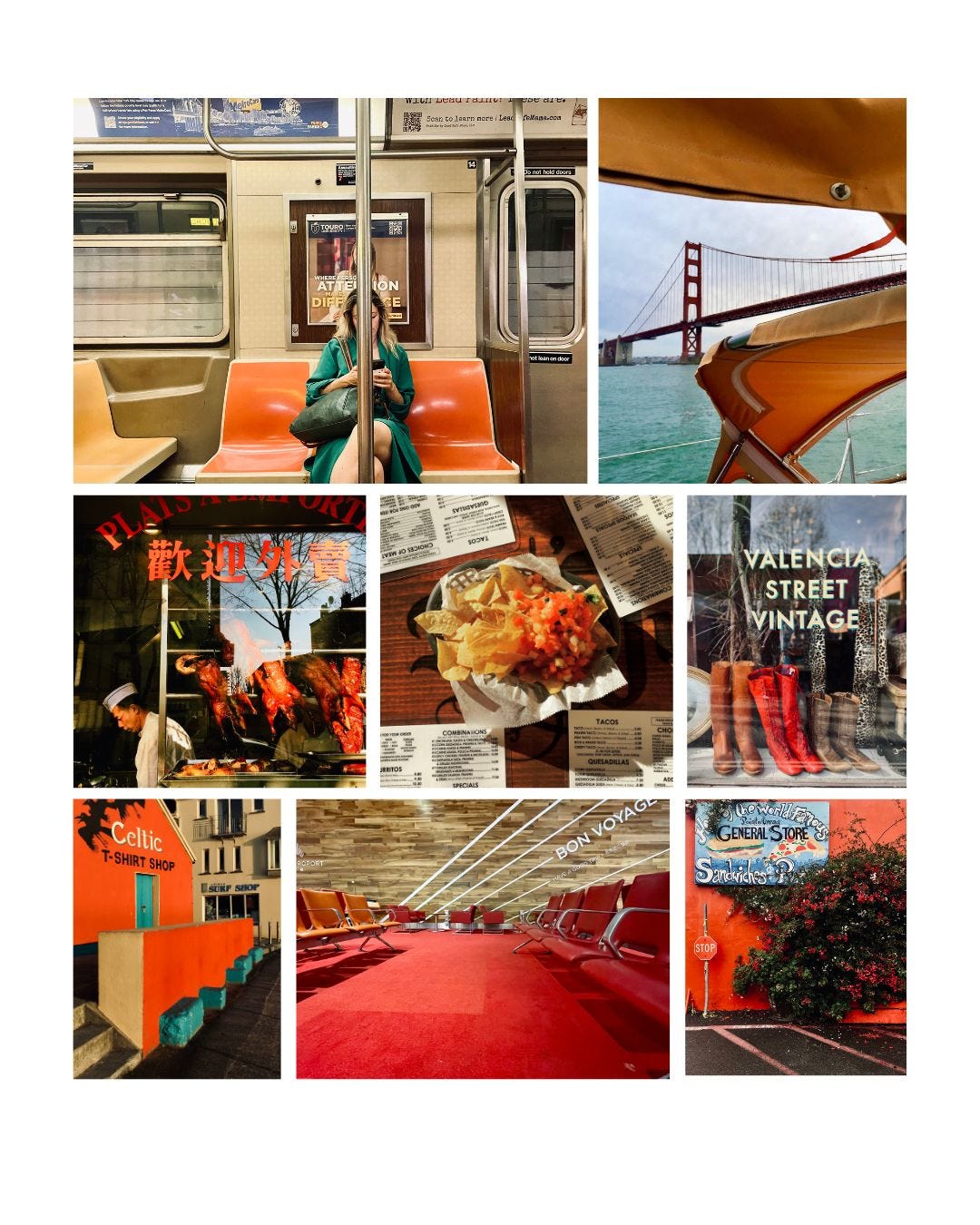
asked if I would consider creating a grid in color. That got me thinking: I’ve used the grid format in my previous job editing and curating color pictures, but I have not applied it to my own images.Like many of us, I have thousands of photos on my iPhone. Where do you even begin, right? As I scrolled through, I noticed several images in the red-orange spectrum that stood out, so I chose them as a starting point to build the grid.
I have to admit—it was more challenging than I expected. Unlike working in black and white, where I focus primarily on leading lines and composition, working with color introduces a new layer of complexity—nuances of hue, vibrance, and saturation.
Take the photo of the Golden Gate Bridge in the top right corner, for example. The boat’s yellow-orange awning and the red bridge feel more subdued because the sky’s brightness along with the turquoise water, dominates the scene. Even though the colors complement the overall grid, the image doesn’t quite work as well as I had hoped. In addition, the graphic composition of the bridge seemed stronger compared to the rest of the selected photos.
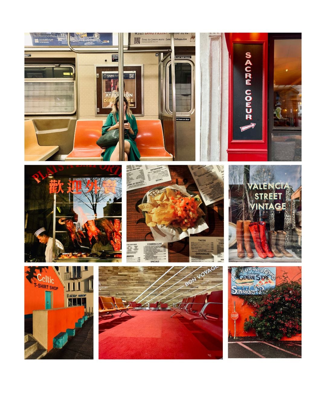
So, I decided to replace it with a photograph of a signage in Sacre Couer and now the grid feels more balanced. Even though the black is still stark it doesn’t grab your eye compared to the sky and water.
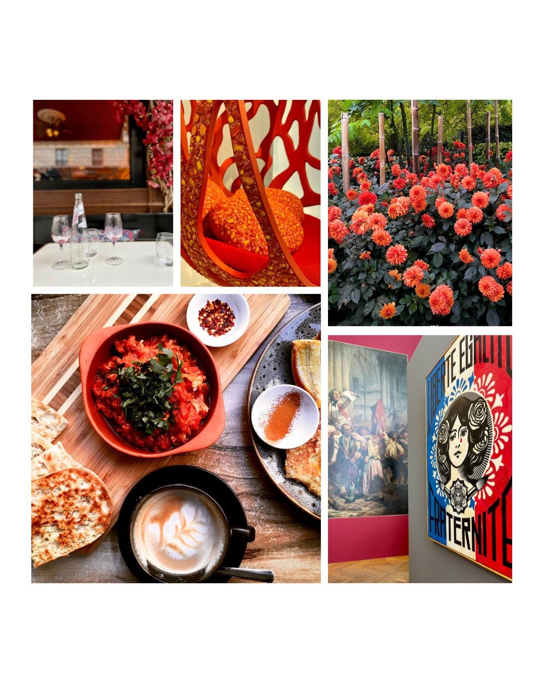
Another example is the grid below. I thought the top right photograph of the red dahlias would complement the tomato dish on the bottom left— the chopped parsley had a similar hue to the leaves while the diced tomatoes mimicked the flowers. However, the bright ferns on the top of the frame easily took my attention. Maybe if I had cropped it out it would’ve been better?
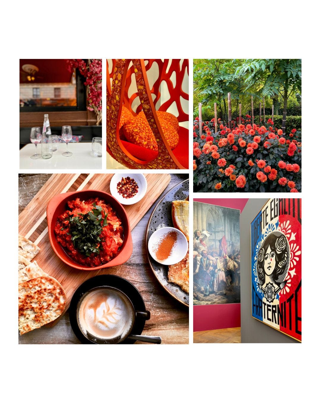
Overall, I think it worked, but I’m not sure I’m completely satisfied with the composition. But, it’s a compromise. Even the bottom right image still hasn’t quite settled with me either.
As you can see, it’s a slow process—but it’s precisely this snail’s pace that teaches me to look more closely, notice subtle nuances, and study the relationship of each photo to the entire grid. In the end, everything is subjective, but looking with intention sharpens my eye, and that’s where the investment pays off. In the long run, that’s what truly matters because I can carry this skill with me, even as gear and technology evolve.
It took quite some time to flesh out these two grids, so I’m afraid that’s all I have for you this week—hence, the late post. I’d love to hear your thoughts, so feel free to meet me in the comments below.
See you all next Sunday.
Thank you for inviting me to join you every Sunday in your inbox. I am grateful and appreciative for spending a small part of your day with me. If you have the means to support Sundays with Stella, please consider becoming a paid subscriber. Those who contribute financially will ensure that this place of inspiration, creativity, and meaning remains free and open to all.
ANOTHER WAY TO SUPPORT SUNDAYS WITH STELLA
I've listened to your requests and created a support page on my website. Now you can contribute to 'Sundays with Stella' in any amount using your credit card, PayPal, or Venmo. Your generosity is truly appreciated!
I love these! I also enjoyed reading your thoughts behind the process. The colors are outstanding! Maybe contrary to popular opinion, I do prefer the bridge. I like to create tension where possible and I think that photo achieves the necessary amount.
I loved the first grid practice post and this one is fantastic as well! Thank you, Stella.
I’m so curious what you use to create the grid? As a photographer, I find the gallery settings and photo sharing design options on Substack pretty limited, but I love how you have shared a collection here. The images don’t look too small and are nicely grouped together.
Thanks for the wonderful creative inspiration!